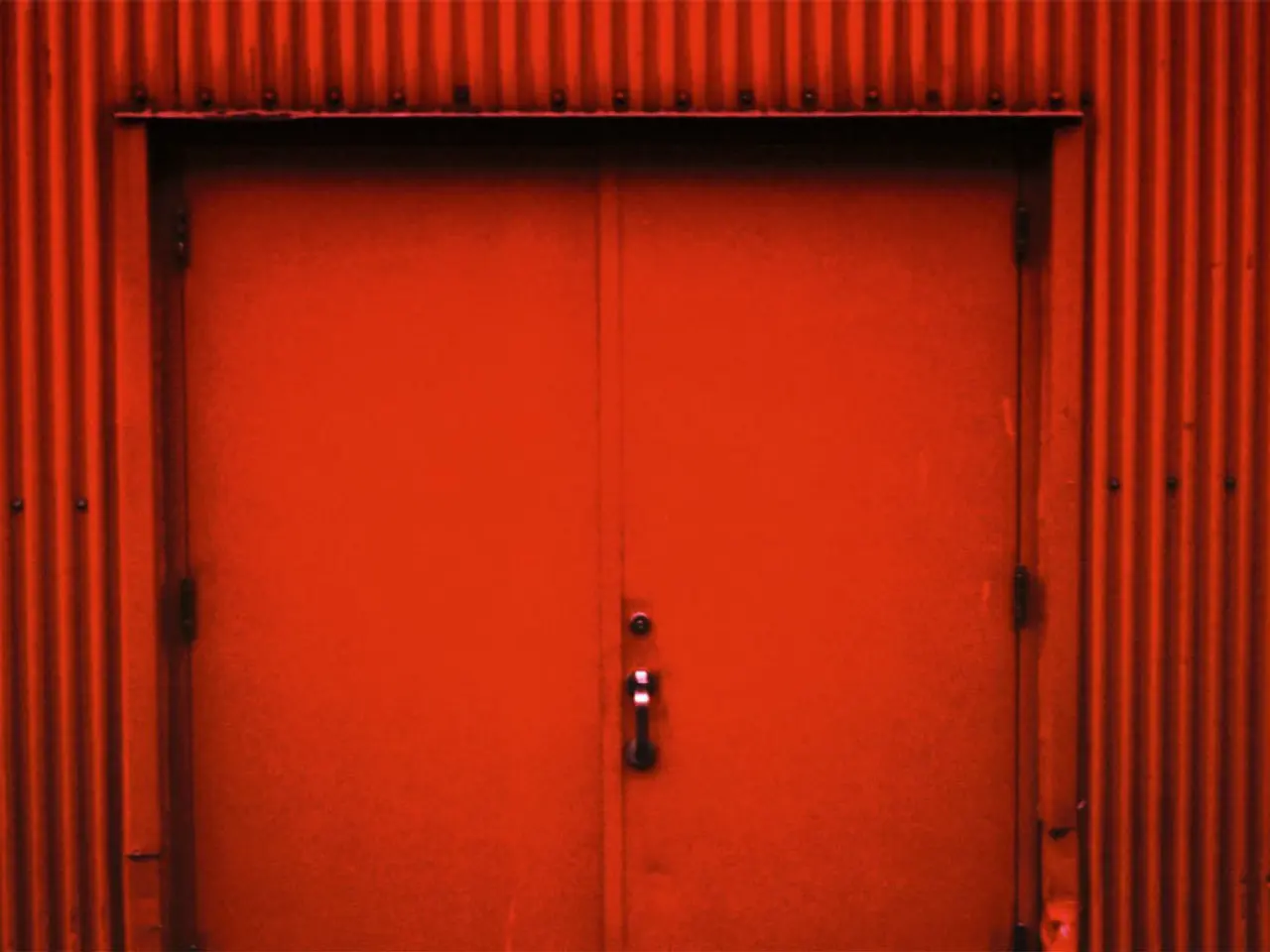
Red Complements: 10 Colors That Stand Out Exceptionally With This Passionate Shade
In recent times, red has made a captivating comeback in the world of interior design, adding depth, dimension, and an unexpected element of passion to spaces. From bold crimson to deep burgundy, the range of red includes vivid scarlet hues, rich maroons, and earthy terracottas, making it a versatile color for any home.
One of the most striking pairings with red is true red with a glossy finish. Soft lavender or rich violet works best with this vibrant hue, creating a sumptuous yet peppy scheme when used as accents in a neutral space. A softer Etruscan or earthy red tone, on the other hand, works harmoniously with pink for a romantic and sophisticated look.
For those seeking a more modern feel, a matt and chalky powder blue finish works well with a bright and bold pillar box red shade. Warm sun-baked brick brown also pairs beautifully with red, delivering depth and a feeling of tranquility.
Red and navy blue is a timeless and classic paint idea, offering vibrancy and sophistication. Cherry red works best as a pop of color against the grounding navy blue, creating a timeless and classic color pairing. In home offices or dining rooms, cranberry red adds depth, while charcoal gray introduces a sleek, modern feel when used as bold accents against charcoal-painted walls or furniture.
However, decorating with red can be challenging due to its dominance. To tame its intensity, warm off-whites like magnolia and cream are the perfect accompaniment, creating a clean, modern look when used together. A gentle greige tones down red for a calming red room idea, creating a sophisticated alternative to white.
After years of minimalism and cool-toned interiors, homeowners are embracing color again, and red, with its associations with passion and energy, is leading the charge. Integrating both red and green via texture helps keep a space from looking too seasonal. From accents to bold feature walls, red is setting the tone for spaces that are lively, dynamic, and full of personality, as people seek out environments that reflect their individuality and emotional warmth.
Brick red and mustard yellow evoke a rustic, earthy charm, making this combination ideal for kitchens or entryways when used as accents like curtains, rugs, or cabinetry. In a family living room, a sophisticated yet playful palette can be achieved by featuring vibrant red color pops in the statement pendant and rug, balanced by rich stained original flooring and softer green tones on the sofa, as designed by interior designer Roisin Lafferty.
Despite the popularity of red, it is essential to avoid pairing it with bright greens, as it creates a jarring contrast that can feel too festive. Instead, subtler shades of green like sage or olive work well with red, creating a harmonious pairing.
In conclusion, red is more than just a color—it's a statement. It adds a touch of drama, a splash of warmth, and a dash of energy to any space. Whether you choose to incorporate it as an accent or make it the focal point of your room, red is undoubtedly setting the tone for interiors that are lively, dynamic, and full of personality.


